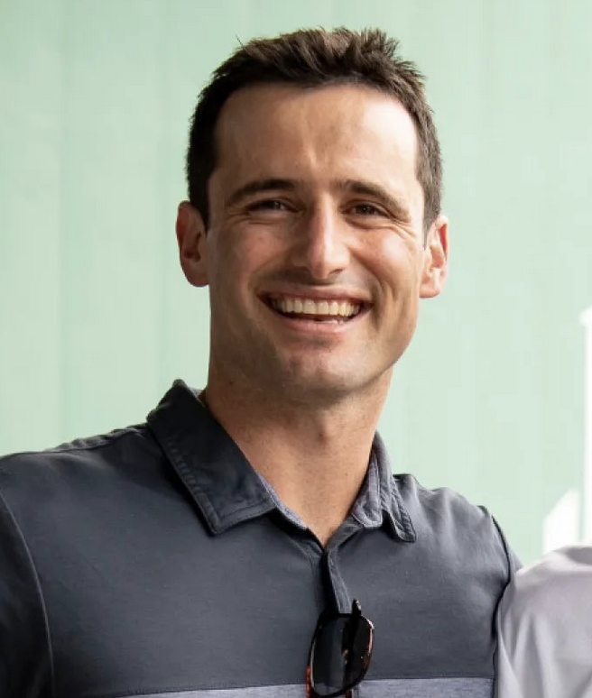
Paul Toboni
★ activeBorn Feb 8, 1990 · San Francisco, CA · age 36
President of baseball operations for the Nationals (2026–present).
Across the full 1-season sample, the measured profile stands out most for cheap-talent surplus (97th percentile). The clearest contrast is avoidance of dead payroll (6th percentile): a larger share of payroll has gone to players below 0.5 WAR than for most peers. Because the sample covers fewer than five seasons, those comparisons are descriptive rather than stable.
1 seasons with salary-era data across 1 stint. All figures are franchise-level outcomes during the tenure, not solely attributable to one executive.
0 pennants · 0 playoff appearances · 77–85 (0.475)
Overview
| Team | Role | Year | Pay $M |
Rel Pay |
Surp $M |
Surp WAR |
Dead % |
Cheap $M |
Draft $M |
Trd $M |
Int'l $M |
$ / WAR |
WAR | Depth | Dead WAR |
HG | Trade | Net/ Trd |
FA | R5 | RFA | PPA | CPA | WAB | TAB | W-L% | PO | Pen | WS |
|---|---|---|---|---|---|---|---|---|---|---|---|---|---|---|---|---|---|---|---|---|---|---|---|---|---|---|---|---|---|
 Nationals Nationals |
POBO | 2026 77–85 | $54 | 33 | +49 | +11.6 | 53% | +69 | +0 | +10 | +4 | $1.6M | 25.5 | 6.0 | -8.0 | +0.3 | +0.9 | +0.18 | -1.3 | +0.0 | +0.01 | 0.33 | 0.07 | +9.1 | +4.6 | 0.475 | |||
| Career total (1985+ data) | $54 | 33 | +49 | +11.6 | 53% | +69 | +0 | +10 | +4 | $1.6M | 25.5 | 6.0 | -8.0 | +0.3 | +0.9 | +0.18 | -1.3 | +0.0 | +0.01 | 0.33 | 0.07 | +9.1 | +4.6 | 0.475 | – | – | – | ||
Roster Construction
Build channels — net fWAR
Acquired minus surrendered / signed minus walked.
Trades
Trades made — 18 deals credited to Paul Toboni, best expected value first; surplus is realized value in $M
WSN · Paul Toboni
+$0.8M
 BOS · Craig Breslow
−$0.8M
WSN · Paul Toboni
+$8.8M
BOS · Craig Breslow
−$0.8M
WSN · Paul Toboni
+$8.8M
 CHW · Chris Getz
−$8.8M
WSN · Paul Toboni
+$3.2M
CHW · Chris Getz
−$8.8M
WSN · Paul Toboni
+$3.2M
 NYY · Brian Cashman
−$3.2M
WSN · Paul Toboni
+$1.6M
NYY · Brian Cashman
−$3.2M
WSN · Paul Toboni
+$1.6M
 STL · Chaim Bloom
−$1.6M
STL · Chaim Bloom
−$1.6M
 CLE · Chris Antonetti
+$5.6M
WSN · Paul Toboni
−$5.6M
CLE · Chris Antonetti
+$5.6M
WSN · Paul Toboni
−$5.6M
 DET · Scott Harris
+$0.0M
WSN · Paul Toboni
+$0.0M
WSN · Paul Toboni
+$0.0M
DET · Scott Harris
+$0.0M
WSN · Paul Toboni
+$0.0M
WSN · Paul Toboni
+$0.0M
 PIT · Ben Cherington
+$0.0M
NYY · Brian Cashman
+$4.0M
WSN · Paul Toboni
−$4.0M
PIT · Ben Cherington
+$0.0M
NYY · Brian Cashman
+$4.0M
WSN · Paul Toboni
−$4.0M
 BAL · Mike Elias
+$0.0M
WSN · Paul Toboni
+$0.0M
BAL · Mike Elias
+$0.0M
WSN · Paul Toboni
+$0.0M
 ATL · Alex Anthopoulos
+$0.0M
WSN · Paul Toboni
+$0.0M
BAL · Mike Elias
+$0.0M
WSN · Paul Toboni
+$0.0M
ATL · Alex Anthopoulos
+$0.0M
WSN · Paul Toboni
+$0.0M
BAL · Mike Elias
+$0.0M
WSN · Paul Toboni
+$0.0M
 HOU · Dana Brown
+$0.8M
WSN · Paul Toboni
−$0.8M
HOU · Dana Brown
+$0.8M
WSN · Paul Toboni
−$0.8M
 LAD · Andrew Friedman
+$0.0M
WSN · Paul Toboni
+$0.0M
LAD · Andrew Friedman
+$0.0M
WSN · Paul Toboni
+$0.0M
 NYM · David Stearns
+$2.4M
WSN · Paul Toboni
−$2.4M
WSN · Paul Toboni
+$0.0M
HOU · Dana Brown
+$0.0M
NYY · Brian Cashman
+$0.0M
WSN · Paul Toboni
+$0.0M
WSN · Paul Toboni
+$0.8M
NYM · David Stearns
+$2.4M
WSN · Paul Toboni
−$2.4M
WSN · Paul Toboni
+$0.0M
HOU · Dana Brown
+$0.0M
NYY · Brian Cashman
+$0.0M
WSN · Paul Toboni
+$0.0M
WSN · Paul Toboni
+$0.8M
 COL · Josh Byrnes
−$0.8M
COL · Josh Byrnes
−$0.8M
 TEX · Chris Young
+$38.4M
WSN · Paul Toboni
−$38.4M
TEX · Chris Young
+$38.4M
WSN · Paul Toboni
−$38.4M
Players acquired — 15 players, by realized fWAR for the franchise (scroll for more)
| Player | Pos | Team | How | Year | Szns | fWAR | WAR/yr | RFA | PPA | CPA |
|---|---|---|---|---|---|---|---|---|---|---|
| Foster Griffin | P | WSN |
Trade | 2026 | 1 | +1.9 | +1.9 | – | 0.6% | 0.14% |
| Curtis Mead | 1B/3B | WSN |
Trade | 2026 | 1 | +1.5 | +1.5 | +0.01 | 0.5% | 0.11% |
| Jorbit Vivas | 2B/3B | WSN |
Trade | 2026 | 1 | +0.9 | +0.9 | +0.01 | 0.3% | 0.06% |
| Joey Wiemer | OF | WSN |
Trade | 2026 | 1 | +0.7 | +0.7 | – | 0.2% | 0.05% |
| Harry Ford | C | WSN |
Trade | 2026 | 1 | +0.4 | +0.4 | +0.25 | 0.1% | 0.03% |
| Riley Cornelio | P | WSN |
Draft | 2026 | 1 | +0.3 | +0.3 | – | – | – |
| Carson Palmquist | P | WSN |
Trade | 2026 | 1 | +0.2 | +0.2 | – | 0.1% | 0.01% |
| Matt Waldron | P | WSN |
Trade | 2026 | 1 | +0.1 | +0.1 | – | 0.0% | 0.01% |
| Paxton Schultz | P | WSN |
Trade | 2026 | 1 | +0.1 | +0.1 | – | 0.0% | 0.01% |
| Zak Kent | P | WSN |
Trade | 2026 | 1 | +0.1 | +0.1 | – | 0.0% | 0.01% |
| Connelly Early | P | WSN |
Trade | 2026 | 1 | +0.1 | +0.1 | +0.01 | 0.0% | 0.01% |
| Jake Bird | P | WSN |
Trade | 2026 | 1 | +0.0 | +0.0 | +0.01 | 0.0% | 0.00% |
| Andre Granillo | P | WSN |
Trade | 2026 | – | -0.2 | – | +0.00 | – | – |
| Max Kranick | P | WSN |
Free agency | 2026 | – | -0.4 | – | – | – | – |
| Miles Mikolas | P | WSN |
Free agency | 2026 | – | -0.9 | – | – | – | – |
Trade-side columns: RFA is playoff-readiness percentage points added to the future roster foundation. It grades the franchise's entire side of a trade, so the same score repeats for every player acquired in that package. PPA/CPA remain player-level arrival-year probability points.
WAB = wins above what the team's payroll predicted (resource-controlled). WAR surplus = era-neutral value (WAR minus payroll in win-equivalents). Roster surplus $M = dollar value of WAR over cost. Build channels (realized fWAR): HG = home-grown via amateur draft / international signing; Trade = acquired minus surrendered (incl. purchases/waivers); FA = signed minus walked; R5 = Rule-5 / minor-league-draft pickups. Credit follows the acquisition year — home-grown to the regime at the player's draft/signing (not whoever was in the chair when he peaked), trade/FA/R5 to the GM who made the move. Players acquired as prospects before debuting (e.g. Smoltz, Bagwell; Rule-5 picks like Uggla) are counted as trade/R5, not home-grown. All are franchise-level outcomes during the stint, not solely attributable to one executive.